The next generation of Give Lively embeddable donation widgets

.svg)
.svg)
.svg)
.svg)
In the digital-first landscape of modern philanthropy, nonprofits are rightly focused on the online giving experience, especially helping donors move from inspiration to clicking a “donate” button. For many years, organizations have relied primarily on external, full-featured, branded fundraising pages to maintain a user's immersion and trust. However, adding embeddable donation widgets alongside traditional fundraising pages offers an even more seamless experience where donors make contributions without ever leaving a nonprofit's website.
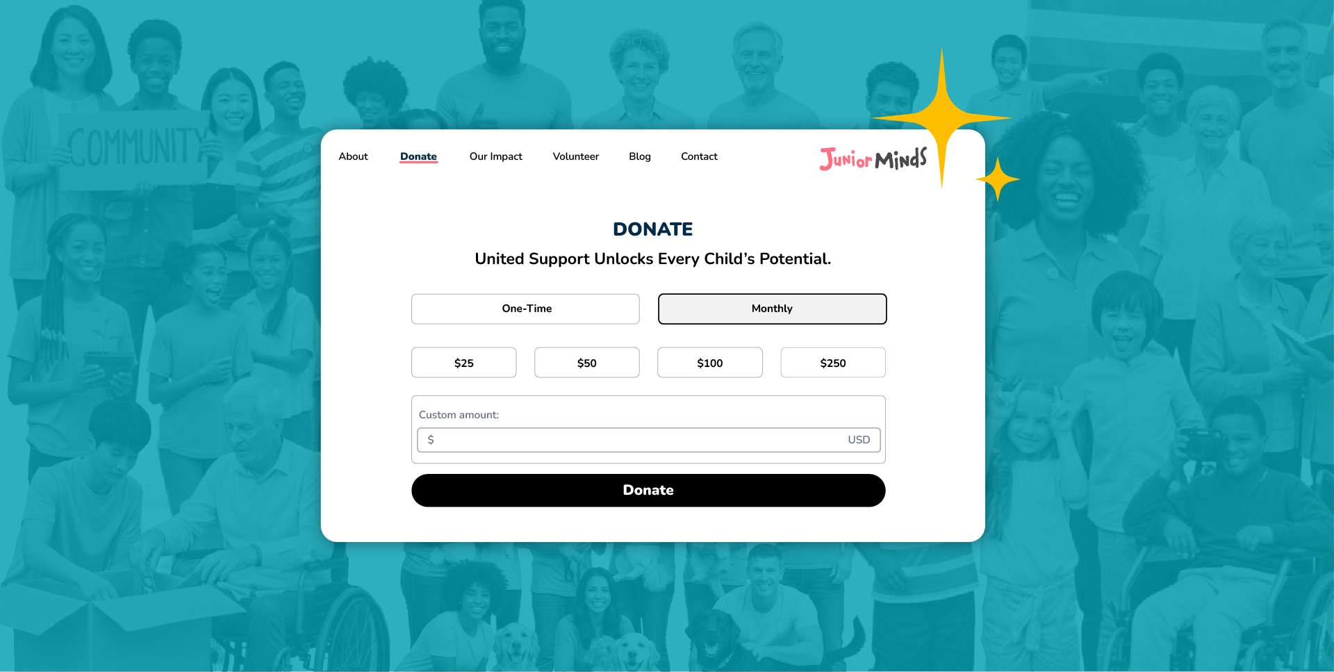
Give Lively is rolling out our latest Simple Donation Widget updates. This isn’t just a cosmetic tweak; it’s a realignment that elevates our technical and user-facing infrastructure to the level of donors’ high expectations. We focused on features, aesthetic cohesion and accessibility to ensure the widget remains a seamless extension of a nonprofit’s mission.
.png)
Why embeddable donation widgets are non-negotiable
Embeddable donation widgets are, increasingly, a cornerstone of digital fundraising for nonprofits with a digital presence.
Brand consistency and trust
For both nonprofits and donors, a "Donate” button that redirects to a third-party webpage may be cause for some security anxieties. In contrast, an embeddable widget keeps donors on the nonprofit's branded domain, fostering trust.
Reduced friction
Standard lore has it that every click is an opportunity for a donor to back out of giving. Widgets sustain the impulse to give, eliminating a click and the loading time associated with redirection to a separate fundraising page.
Conversion optimization
Embedded widgets handle donation transactions through a streamlined interface. Data consistently shows that these forms convert at higher rates than external redirects.
Widget evolution through design
The core motivation behind our latest donation widget update is parity. We believe that donors using our Simple Donation Widget should have the same premium experience as donors on any other dedicated fundraising page.
Aesthetic alignment
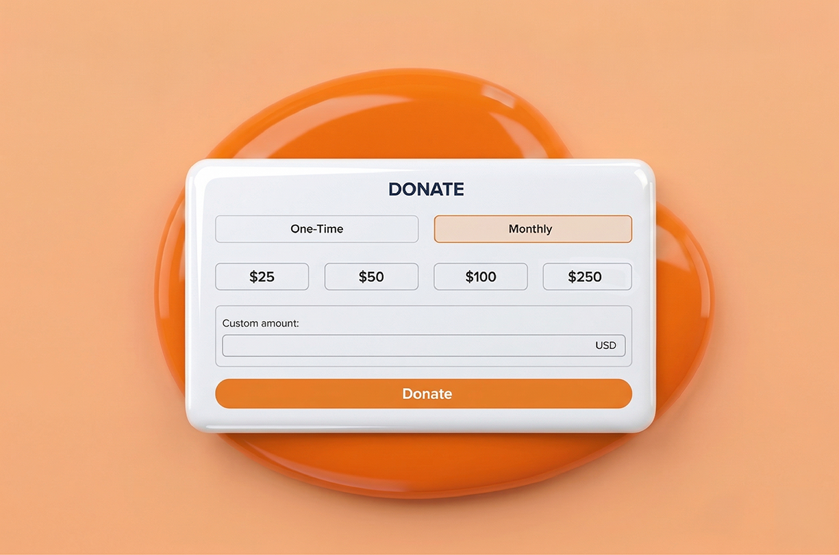
To achieve this, we redesigned every element of the widget to match our Campaign Page design refresh.
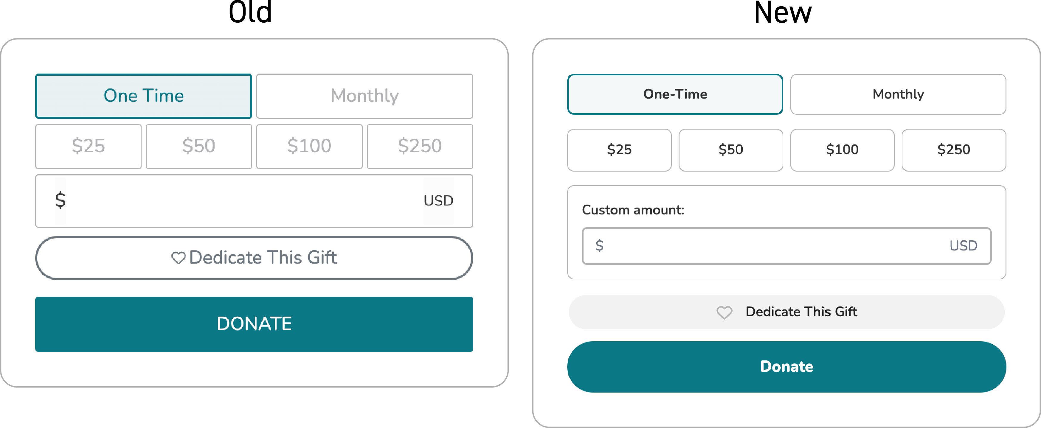
We’ve standardized:
- border weights and radius – Input fields now feel tactile and contemporary.
- interactive states – The hover and selected states of input fields reduce errors and frustration.
- padding and spatial balance – Overall spacing has been adjusted to make it easier to navigate on both desktop and mobile screens.
Visual feedback
Displaying system status might seem like a small change, but it is psychologically significant; it informs donors that a requested action is underway.
- Spinning loading circle – A new spinning loading circle lets donors know that a donation transaction is being processed, easing the urge to click multiple times and possibly create duplicate charges.
- Loading skeletons – Instead of a blank screen while some popup information is loading, we’ve added a "skeleton" outline of the content to reduce perceived wait time and assure that wheels are in motion.
Updated widget modals and flow
A “modal” is a window that pops up to handle specific tasks. We’ve overhauled the two modals in use with the Simple Donation Widget.
Enhanced donation modal
The main donation flow now feels like the same guided journey donors experience on a Campaign Page.
- Breadcrumbs – We’ve completed the rollout of this donation progress indicator. Donors can see exactly where they are in the flow (e.g., Amount > Information > Payment), which significantly lowers abandonment rates.
- Mobile optimizations – With a significant (and growing) number of donations occurring on smartphones, we’ve added an easy “X” to close out of the modal on mobile devices.
New “dedication" modal
Remembering a loved one is a deeply personal act. The new “Dedicate This Gift" modal honors that intent with a cleaner interface.
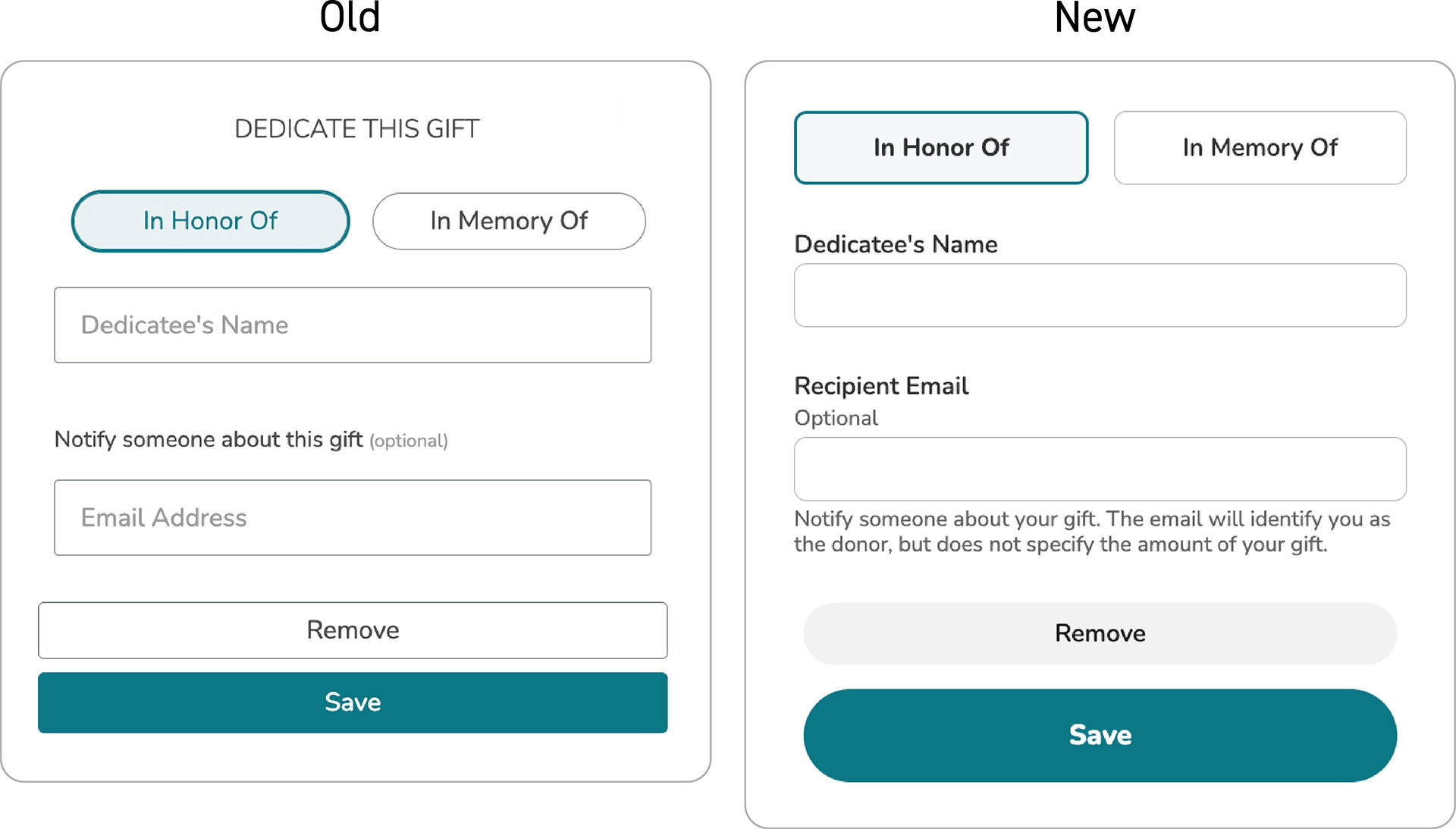
- Clear field labels – For both clarity and accessibility reasons, the descriptions of input fields have been placed outside the fields. Donors have an easier time keeping track of what information belongs in which box.
- Explanatory text – We’ve added language that guides donors through the dedication process, specifically ensuring they know how their dedication message will be delivered.
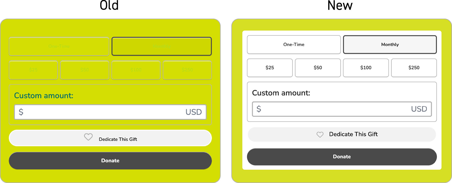
Accessibility for everyone
At Give Lively, we believe that accessibility is a fundamental right and are working to conform to digital access standards. Accessibility has been taken into account with the Simple Donation Widget updates.
- Keyboard tabbing – Not every donor uses a mouse, so donors can now more easily move through the donation process using only the Tab and Enter keys, with visual indicators to show progress.
- Color contrast – Widget color palettes ensure high contrasts, an aid to donors with visual impairments and everyone on mobile devices in bright sunlight.
- White background – To avoid website colors masking widget features (amounts, field outlines etc.), widgets now automatically have a white background.
Bridge of trust
The latest updates to our Simple Donation Widget make it more appealing, efficient and inclusive. It may just seem like a collection of small details: a spinning loader, a clear label or a well-placed breadcrumb. But details matter and, taken together, build a bridge of trust that helps sustain the nonprofit sector.