Small details, big impact: our latest accessibility and design updates

.svg)
.svg)
.svg)
.svg)

A donor using a keyboard to tab through a form. A projector screen displaying a goal thermometer in a crowded gala hall. A supporter scanning a QR code between courses at a benefit dinner. Good fundraising technology should handle all three scenarios, not just someone using a mouse in a quiet room with a fast connection.
That belief shapes what features are part of the Give Lively platform. In recent months, it’s also guided updates to Event Ticketing, Live Display and Simple Donation Widgets. They advanced two connected goals that help underpin our keystone values:
- making the platform more accessible
- making it look and feel better to use.
Here's what changed and why each revision matters.
Accessibility improvements
The work to design accessible features often involves enhancements to details most people will never notice, but that make or break the experience for people using screen readers, keyboard navigation or other assistive technology.
We've been thinking about this work at a company level, as well as the product level. We recently covered what our Building Belonging webinar taught us about how nonprofits should work for every donor and, for the legal backdrop, what the Americans with Disabilities Act means for nonprofits.
This round of updates touched two of our products.
Event Ticketing pages
For an event, a ticket-purchasing page is likely a nonprofit's first impression on a potential attendee or donor. But for someone navigating by keyboard or listening to the page through a screen reader, small design and coding choices determine whether that first impression is a good one, so we rebuilt the Event Ticketing pages from the ground up.
- The event details column is wrapped in a “landmark.” Landmarks allow screen reader users to jump between content blocks on a page. This means users can move more quickly to event information instead of getting bogged down in other content first.
- "Add to Calendar" options are assembled as a list, so Google, Apple, Outlook and Yahoo read as a set of related choices, not a string of disconnected links.
- Event logos now have descriptive "alt text," so a screen reader states the organization's name.
- Background and cover images added by page administrators can now be fully described, giving them an “alt text” for people who can't see them.
- Social share icons announce their purpose. The Facebook, X, LinkedIn, email and text buttons are now decipherable by screen readers as "Share on Facebook" or "Share by text," not as unlabeled links.
- The copy-link option is a real button with a clear label, matching what it does on the page.
None of these changes are visible to sighted people or mouse users. They exist for people who need to know what a button does or what appears in an image.
For a broader look at how to think about accessibility on a nonprofit's website and at its events, see our blog post about accessibility best practices for nonprofits: web and events.
Simple Donation Widget
Alongside a recent visual refresh of our Simple Donation Widget, the widget got accessibility upgrades addressing two key concerns:
- The dedication and payment pop-ups now close with a click outside them or a tap of the Escape key. This lets keyboard and screen reader users exit that window and continue their donations.
- The “Donate" button meets accessibility contrast standards, so donors with low vision can clearly see and tap this single most important element on the page.
Design and user experience improvements
Accessibility and good design aren't separate tracks; a clean interface is easier to navigate, no matter how someone views it. This next set of updates focused squarely on how each product looks, feels and holds up in real-world use.
Event Ticketing pages
Beyond the accessibility work, event pages got a facelift to make it more visually consistent with how we refreshed our Campaign Page templates.
- The embedded Google Maps preview is gone, replaced by a link that opens directly in Google Maps. It matches the look of our Campaign Page and gives people a map experience they are familiar with.
- Pages without a cover image automatically get a default heart graphic in the nonprofit's brand color, so no event page looks unfinished.
- We use a single, consistent typeface (Nunito) across the page.
Small as these changes may sound, they add up to more polished and intentional event pages, regardless of how much time a nonprofit has to invest in full customization.
Live Display
With the introduction of scan-to-give QR codes to Live Display pages, we've written about why Live Display should be part of every fundraising event.
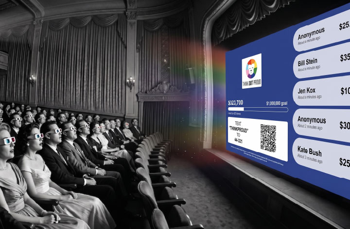
But while the QR code is the biggest upgrade, it’s not the only one. This round made the QR code more useful, more measurable and more trustworthy, alongside a faster and more reliable display overall, still styled automatically in a nonprofit's brand colors.
- Nonprofits control when the QR code appears. It can be added or removed as needed with one click in the Nonprofit Admin Portal.
- No overlapping elements. No piece of the page crowds out any other, especially the goal thermometer.
- Every scan is tracked back to the gift it inspired, all the way down to the donation report. Nonprofits have a clear answer to whether a QR code raises money.
- QR scan data flows into Salesforce (for those who use it), giving nonprofits a complete picture of their fundraising with no extra manual work.
- The fundraising goal and underlying data update in near real time, so donors see their impact.
- The Text-to-Donate instructions are simplified, making clear that there are two easy pathways to giving: a text code and/or a QR code.
- The live donor roll and goal tracker are more reliable behind the scenes, so nonprofits and donors can trust what's on screen during live events.
Getting the small, easy-to-overlook details right at an event is vital. It's also a theme that runs through our guide on how to stop things from going wrong at fundraising events for nonprofits.
Simple Donation Widget
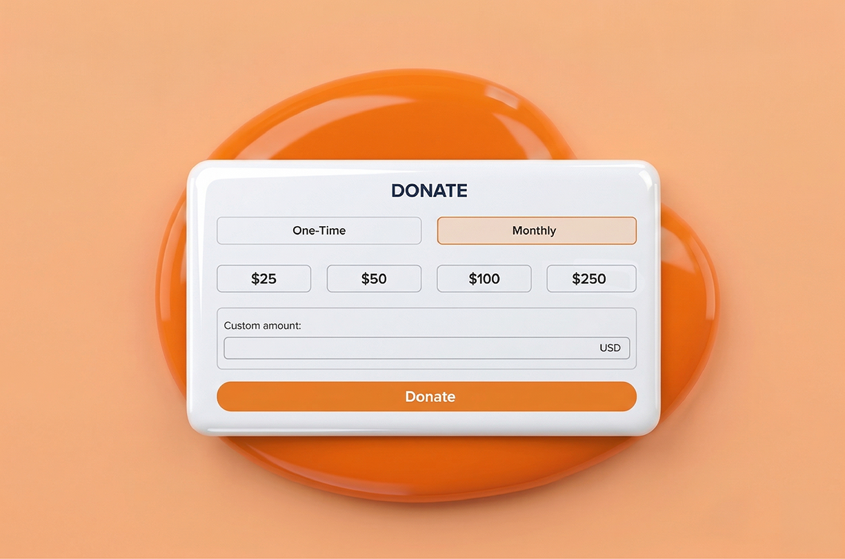
As we outlined in the next generation of Give Lively embeddable donation widgets, we’ve rebuilt it using a modern, brand-aware design system.
- It displays a new amount and frequency selector, a redesigned custom-amount field and a refreshed dedication and payment flow.
- The improvements are in direct response to member feedback. Supporters and outside developers took the time to flag concerns and we used them to shape our top priorities.
- Then we tackled smaller fixes, including brand colors that apply to buttons and the dedication heart, form fields that hold their borders and refined alignments.
After a careful three-phase rollout with temporary opt-outs for nonprofits needing styling revisions, every nonprofit is now on the new widget. Every organization benefits from the same modern, accessible giving experience.
Why this work matters
No single update exists in isolation. A donor using a screen reader, a nonprofit staffer checking an Event Ticketing page on a phone, a supporter scanning a QR code at a gala: they're all interacting with the same platform, and each deserves an experience that works well and looks good.
That's the standard Give Lively holds to, one to keep working toward, one detail at a time. Learn more about our ongoing accessibility conformance efforts on our people and planet page.
All Give Lively fundraising products, including Event Ticketing, Live Display and the Simple Donation Widget, are free for member nonprofits. To explore what the Give Lively platform has to offer, sign up for a demo or apply for free membership to get started.
%201.svg)